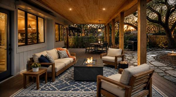
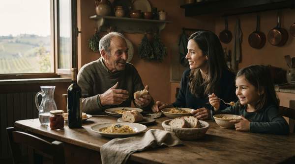
Your living room walls might glow with the welcoming warmth of burnt orange, a deliberate shift from the cool grays that dominated the last decade. Our homes will wrap us in hues that feel like a comforting embrace, a visual antidote to the starkness we've grown accustomed to. This 'Newstalgia' approach invites palpable coziness back into our lives, promising true sanctuaries.
Contemporary design has long favored stark, neutral palettes, prioritizing clean lines and understated elegance. Yet, the emerging Newstalgia trend reintroduces vibrant, comforting colors like orange and terracotta. This tension between sterile minimalism and a widespread yearning for emotional richness drives our aesthetic evolution, pushing us towards spaces that nurture the soul.
Homes will likely prioritize emotional comfort and optimistic retreat over stark modernity. This isn't just about paint; it's about curating a feeling, a personal haven where every shade contributes to a deeply human experience.
Beyond Beige: The Return of Warmth
The sterile uniformity of minimalist design, with its cool grays, now yields to a soulful, expressive palette. Orange, terracotta, and spice-inspired hues offer warmth, depth, and optimism, reports Homes and Gardens. This isn't merely a retro revival; it's a sophisticated blend of past comfort and future-forward optimism, a foundational shift rejecting cold, impersonal modernity. Our homes, after all, should declare our desires for warmth and genuine connection.
The Psychology of a Welcoming Glow
These colors resonate deeply, touching a nerve cool palettes simply couldn't. Burnt orange, for instance, excels as a backdrop in naturally lit rooms, creating a welcoming glow, notes Homes and Gardens. This isn't just about the shade; it's how it transforms sunlight into palpable warmth, turning spaces into havens. A mere color can evoke such profound peace, a visual hug for the soul.
A Lasting Palette for Modern Living
The orange and teal combination is predicted to remain relevant beyond current trends, according to Homes and Gardens. The orange and teal combination's sustained relevance suggests Newstalgia isn't a pure return to monochromatic warmth, but a sophisticated pursuit of emotional comfort through balanced contrasts, preventing visual monotony. Companies focusing solely on singular warm tones for 'Newstalgia' risk missing this nuance. The enduring appeal of orange and teal demands dynamic, balanced palettes, not simple comfort. The enduring appeal of orange and teal's surprising longevity of a contrasting, cooler element ensures the aesthetic remains sophisticated, preventing an overly saccharine feel and adding a witty spark to the cozy narrative.